Project Overview
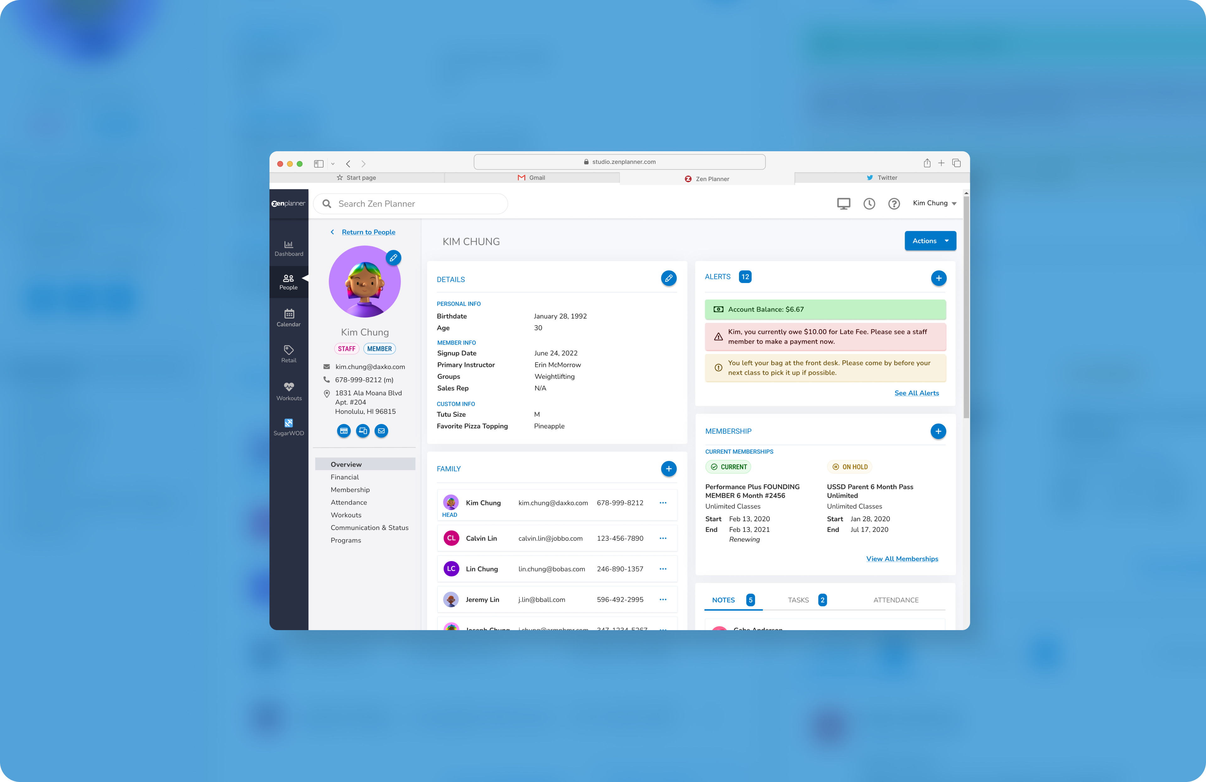
Previous attempts were made at redesigning Zen Planner’s UI but with the scope of the project being too large, it was hard to complete. This project proposed essentially a facelift with some simple CSS changes and established library components to bring to life a more modern design. Once the visual components are complete, we then can consider rearranging content for a newer user experience.
Execution
Typography
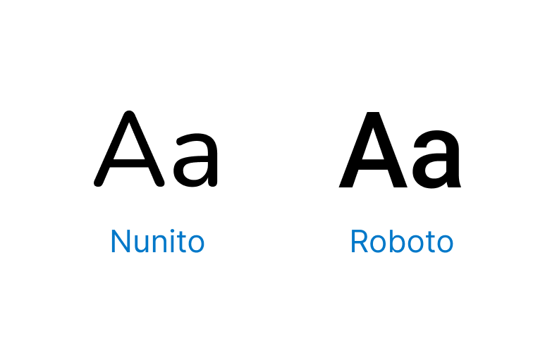
Nunito is a great simple sans-serif font with a friendly flare. I’ve chosen for it to be used for body text and display copy. To balance the rounded edges, I’ve paired it with Roboto for our headings for a modern, and crisp contrast.
Iconography
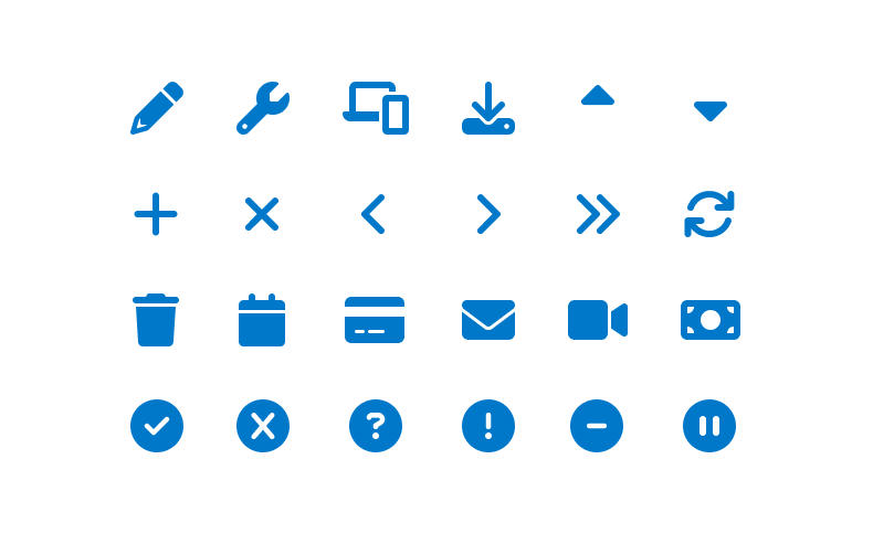
Icons in the Studio App act as visual aids to help users complete tasks. In the Zen Planner design system, we use the Font Awesome icon library because it’s simple, informative, and versatile. With over 450+ icons available, we’re bound to always be able to find a suitable match. The simplicity that Font Awesome offers also helps users understand the concept the icon represents and recognize icons on smaller screens.
Color Palette
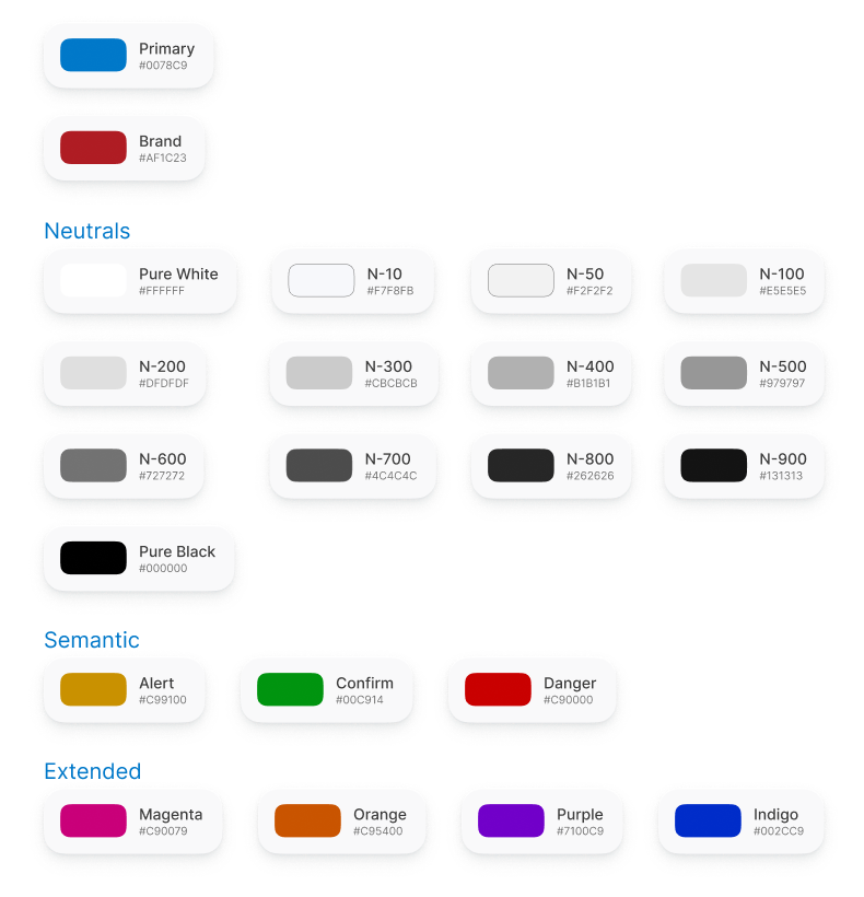
A harmonious color system is essential to distinguishing our brand and helps bring consistency, scalability, and efficiency. No longer will we be sampling for the same shade of red or starting from scratch every time.
Though red (#AF272F) is the primary color for the Zen Planner brand, it is used sparingly within Studio. Instead, blue (#0078C9) is used as the primary color within Studio App, with white and grays serving as complementary across the color palette. Additionally, I’ve established the desired hues for the semantic colors (good, bad, or warning) and included an extended palette for other visual usages.
Buttons
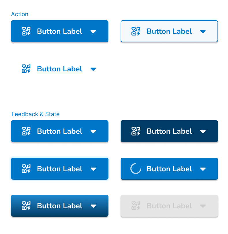
We all know what buttons are, but what we may not realize is that there are many types, variations, and states for a single button. For Zen Planner, there are 3 button types – Primary, Secondary, and Tertiary. There are a number of variations with or without icons and labels. Lastly, there are the following states and feedback on a button: Default, Focus, Hover, Active, Loading, and Disabled.
Other Components
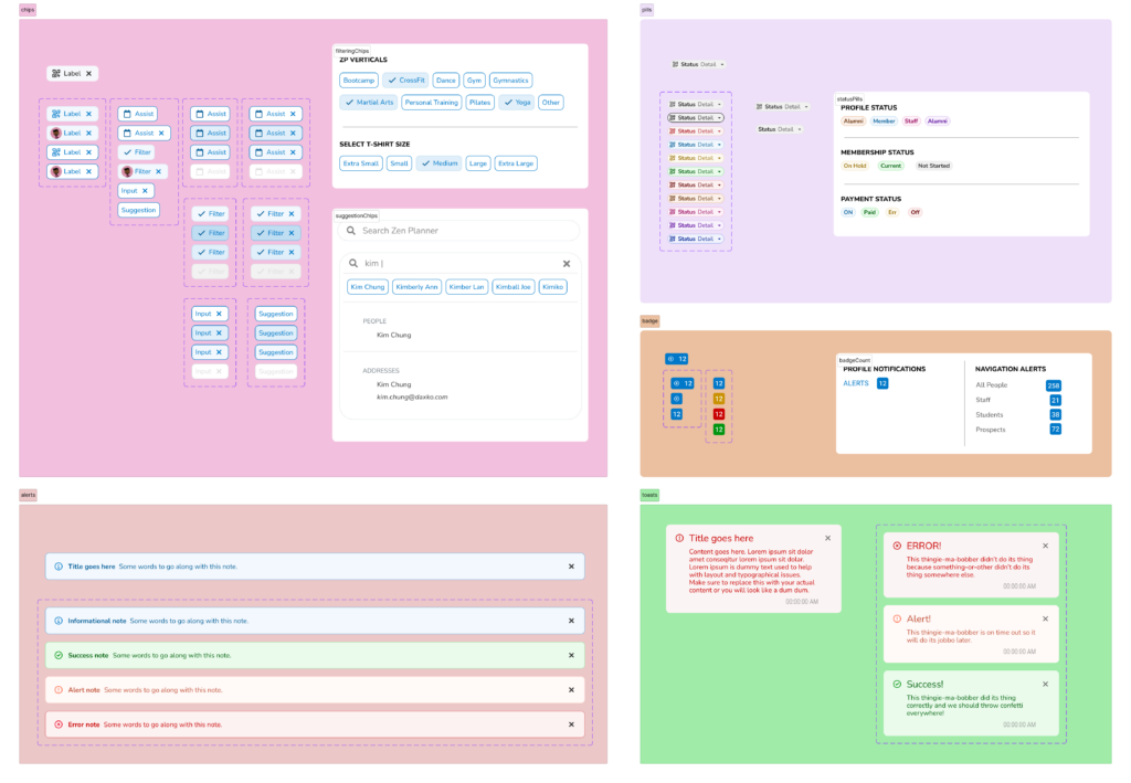
Design systems are complex and this project is only the beginning of components for Zen Planner. The following are other components that I have created (pills, chips, badges, alerts, and toasts). However, as the design system grows, more components will be added and some components will be re-done to match the greater parent company (Daxko) design system and best practices.
Results
While “Operation Oh My, You’re So Stylish” was initially only meant to be a UI refresh for Zen Planner’s Studio App, it became the first step towards an established design system and component library. Since design systems are like complex living organisms that continue to evolve, there are other deliverables required aside from what I’ve accomplished so far. The following is what I have been able to start with this project:
Documentation
Using Confluence, which is a shared space, I have documented when and how to use the design system. I’ve also included notes on what has changed from the previous UI.
Visual Language and Brand Guidelines
In collaboration with our Marketing team, we’ve met to discuss a guide that speaks about what the brand feels like. This includes principles, tone and voice, writing style, and more.
Component Library
Also referred to as a “pattern library”, this includes the collection of UI elements seen above – the design of buttons, the selection of fonts, as well as other typography and visual elements.
CSS Framework
With our engineers, we’ve discussed how the front-end code would be used to build the new design system. In establishing better typography hierarchy and overall accessibility, some of the CSS classes and ids were updated and custom divs were removed for consistency.
While this project’s UI work is complete, the Zen Planner design system is a work in progress as we continue to add more components to the library. Additionally, we are expanding the usage of the design system to Zen Planner’s Member App, Staff App, Kiosk, and Front Desk.
